Hawthorn senior living
Home senior living UI UX Project Design.

Overview
Hawthorn Senior Living is a company that offers life-enriching retirement living for seniors, with curated amenities and services tailored to independent lifestyles.
They manage over 77 communities across the United States, each with its own internal website featuring amenities specific to its city or region.
The primary challenge was their outdated and disorganized website, which lacked a user-friendly structure and accessible design, particularly for their target audience of individuals aged 50+.
The goal was to design a main website that clearly communicated the company’s overall vision while seamlessly connecting users to each community’s website. This required creating a navigable, clear, and responsive architecture that would enhance the user experience.
What did I do?
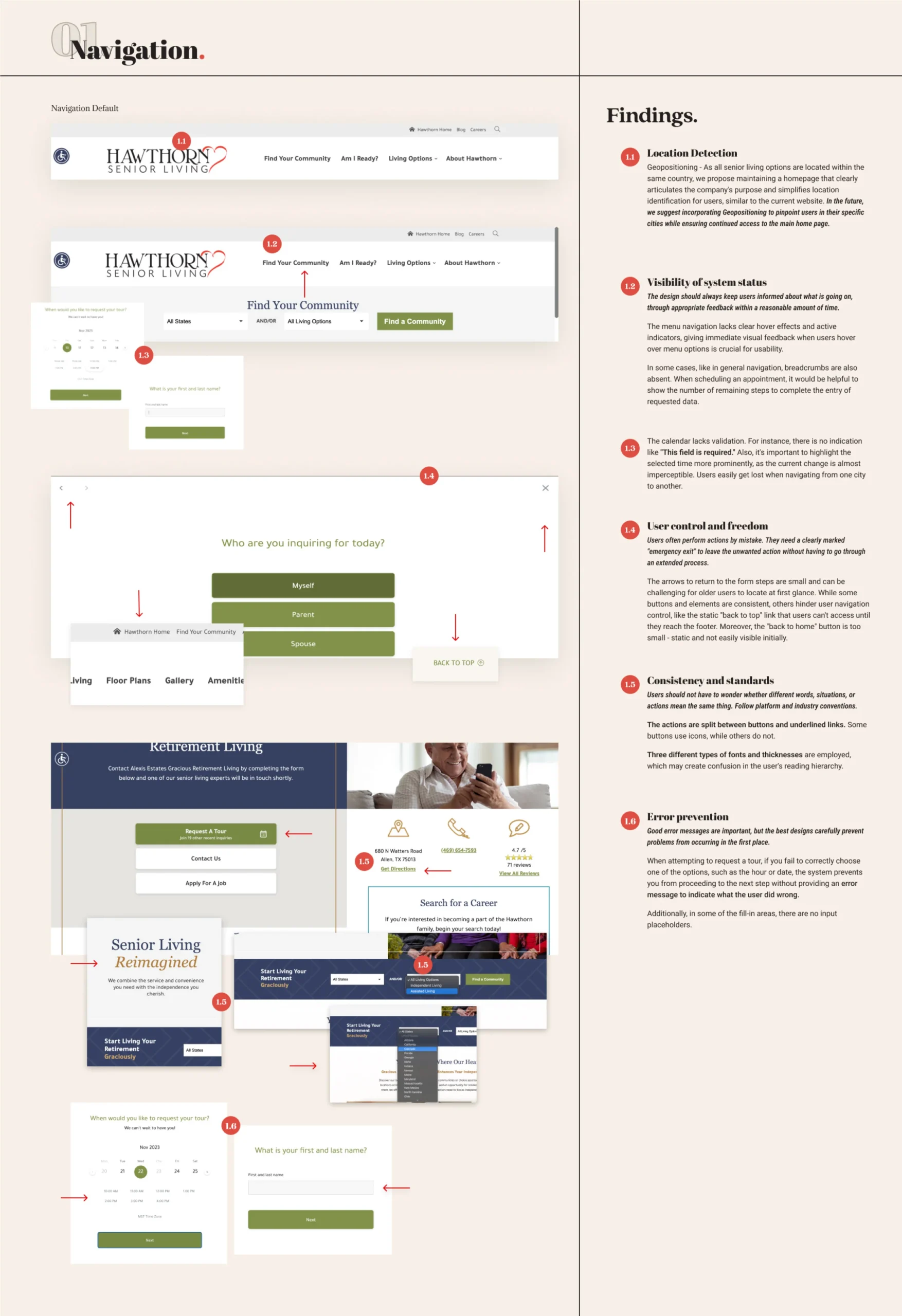
As a UI/UX Product Designer, I crafted an engaging and accessible website with intuitive navigation. I started with a thorough heuristic evaluation of the existing site, identifying usability issues, pain points, and areas for optimization. By analyzing user data and behavior patterns, I developed data-driven recommendations for the redesign.
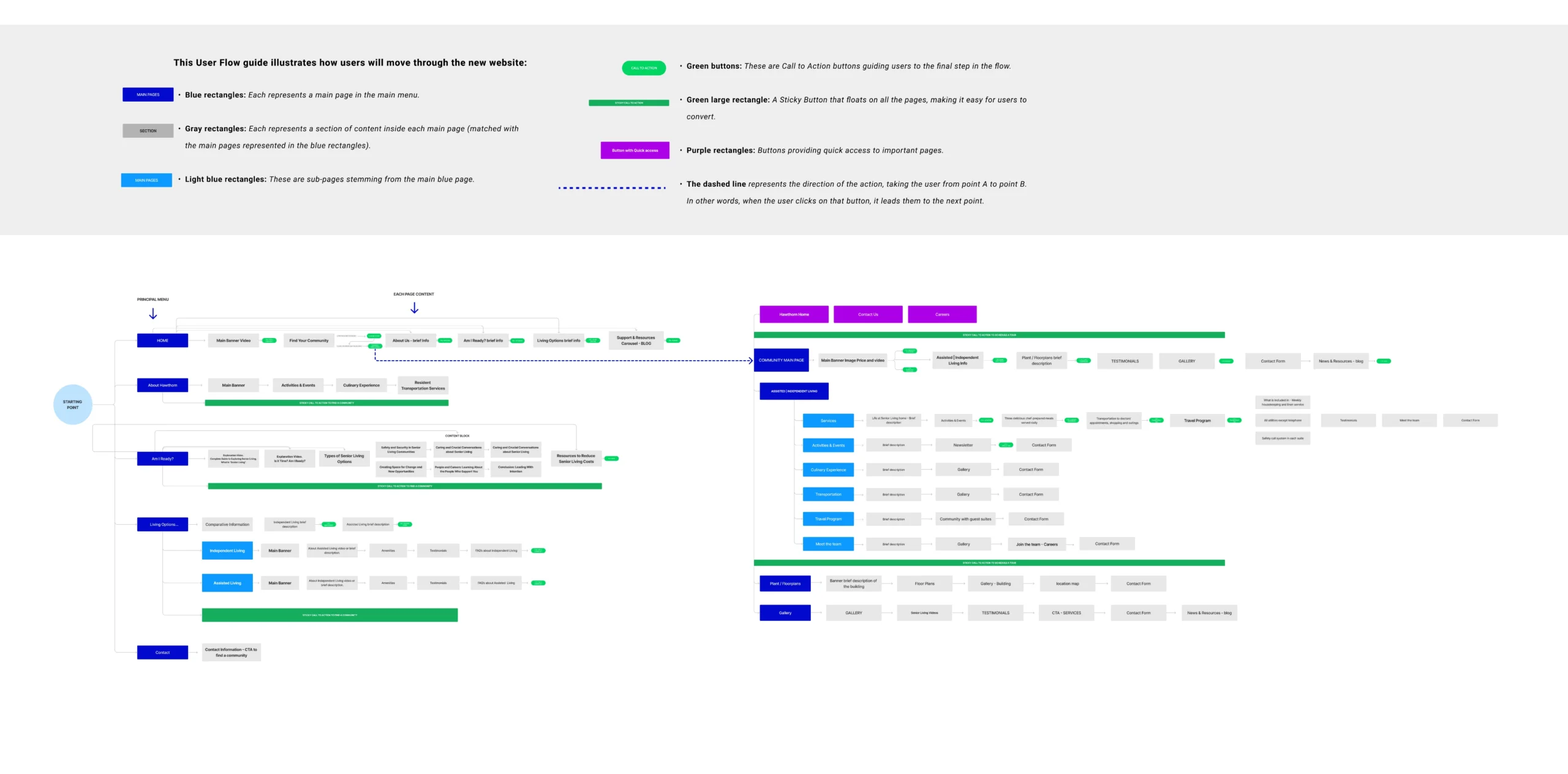
I then created a detailed User Journey Map, integrating user personas provided by the company and insights from user research to align with market preferences. Additionally, I designed a User Flow Map to ensure a frictionless user experience, eliminating dead-ends and minimizing content redundancy.
The project involved designing two interconnected websites: a primary site leading to secondary sites, each tailored to individual communities. The goal was to maintain seamless navigation and a cohesive user experience across both platforms.
Fonts
The fonts were specifically selected to enhance the site’s accessibility. Initially, the brand did not have a defined brand guide with established design elements, so I developed a brand concept that captured the essence of the company.

Color Pallete
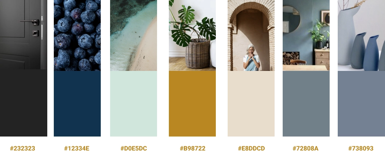
The color palette chosen was designed to evoke feelings of calmness, peace, tranquility, and trust. Additionally, to ensure accessibility, I selected the main colors with better contrast, which are used for titles, main text, icons, and buttons.
Content Architecture and Site Map
The site architecture was designed to facilitate navigation for our target audience, adults aged 50+, from the main homepage to the internal pages of each community by city, ensuring a user-centric approach that aligns with our business objectives.
I achieved this by creating sitemaps for each page, aligning with the shared goals and needs of both consumers and Stakeholders. Sitemaps were developed using Flowmapp, which enabled me to generate mini-wireframes for rapid ideation. Each page is optimized to fulfill its navigation purpose, helping us identify user pain points and ensuring that they can easily find the information they are seeking.
Ideate & Prototype
HI – FI Wireframes

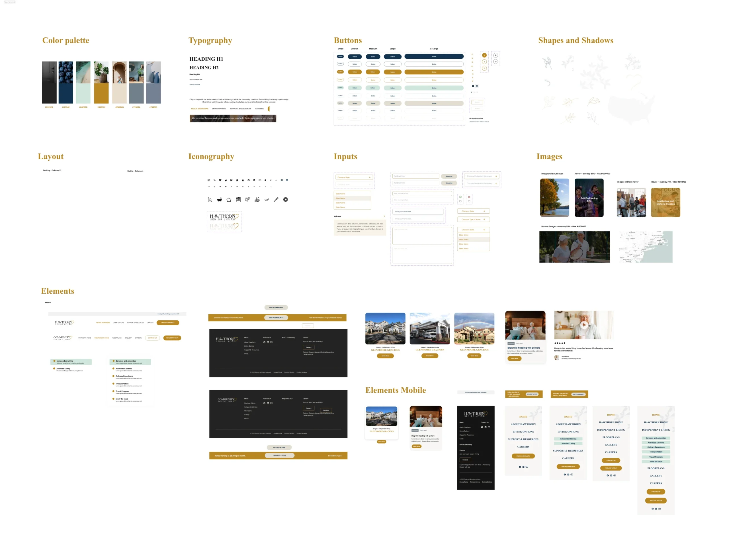
UI Kit

Final Product
Throughout the design and development process, I worked closely with the non-profit organization to ensure that the website met their needs and reflected their mission. The end result was a website that was visually appealing, easy to navigate, and accessible to all.
As the project involved both design and development, I provided direction to the web development team to ensure that the website was built to our exact specifications. The result was a website that not only met the needs of the non-profit organization, but also helped them to better serve their community by providing safe and consistent access to community events.
My LatestWorks
Here, you’ll find a collection of my most recent projects, showcasing my skills and expertise in a variety of fields.
