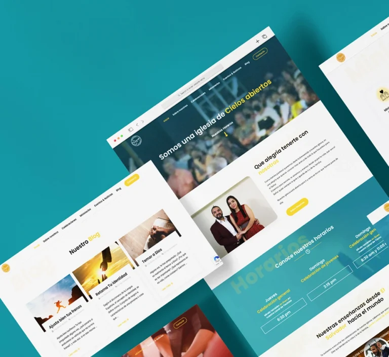
Agape Church Website Design
A website designed to assist caregivers in their care duties and help them to communicate their support needs through Person-Centered Documentation.

Overview
Agape Church is a group of 700 individuals located in El Salvador, Central America. Their goal was to establish a website that would serve as a platform for their members and others from different countries who are interested in joining the church.
This website would not only provide information but also allow individuals to subscribe to church events, watch sermons, participate in ministries, and keep updated with all the latest news from the church.
What did I do?
In my role as their web design project partner, I created a website that not only looked visually appealing but was also user-friendly for all participants and visitors. To achieve this, I utilized UI/UX design practices, beginning with an understanding of my client’s goals and the characteristics and needs of their users. Along with their internal team, we defined their funnel and principal conversion actions, as well as their content architecture and web flow.
I focused on the user experience for each page, creating a site-map that included even the processes for each form required to become part of their ministry and community.
Fonts
In my role as their web design project partner, I created a website that not only looked visually appealing but was also user-friendly for all participants and visitors. To achieve this, I utilized UI/UX design practices, beginning with an understanding of my client’s goals and the characteristics and needs of their users. Along with their internal team, we defined their funnel and principal conversion actions, as well as their content architecture and web flow.
I focused on the user experience for each page, creating a site-map that included even the processes for each form required to become part of their ministry and community.

Color Pallete
The brand’s color palette symbolizes brightness and joy. I carefully chose the primary colors with the best contrast to use for elements such as titles, icons, and buttons. For the main text, I opted for black to ensure easy readability.
Content Architecture and Site Map
The website had three main objectives: to provide live streaming of sermons, to make it simple for users to find and subscribe to church events, and to make it easy for users to find and subscribe to join a ministry.
To achieve these objectives, my client and I developed an information flow based on a conversion funnel. At every stage of the flow, we added buttons that would guide the user towards the desired actions.
I created a site-map based on this funnel to ensure that the content architecture was well-organized and optimized for user navigation to provide an excellent user experience for anyone who visited the website.

Final Product
I worked closely with the church team throughout the design and development process to ensure that the website fulfilled their requirements and conveyed their mission and vision. The outcome was a visually attractive and user-friendly website.
Since the project encompassed both designing and developing, I guided the web development team to guarantee the website’s construction aligned with our precise requirements. The outcome was a website that fulfilled the church’s demands and boosted their ministry procedures.
My LatestWorks
Here, you’ll find a collection of my most recent projects, showcasing my skills and expertise in a variety of fields.
