My Places Website Design
A Website made for real people, with desabilities.
Overview
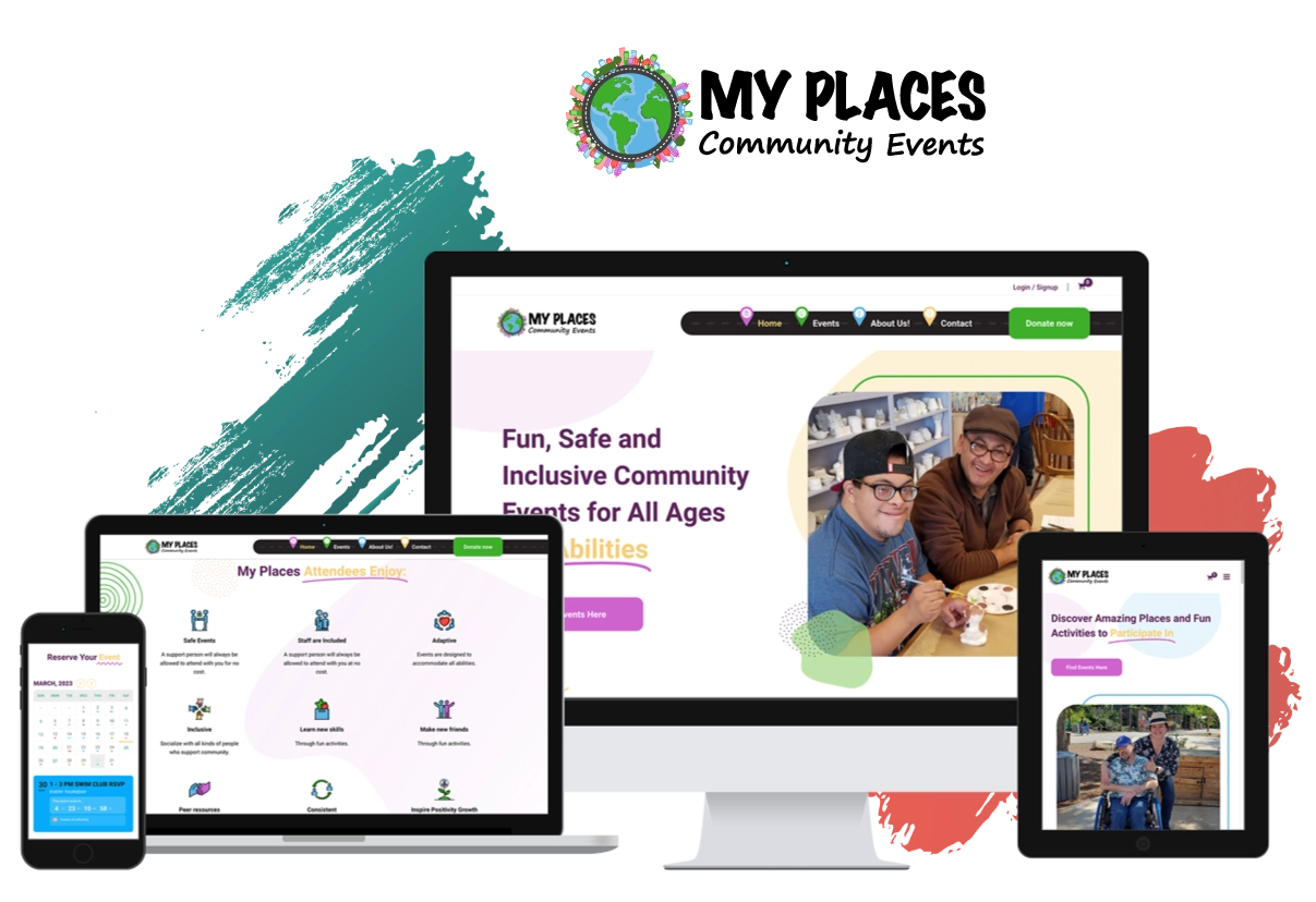
My Places is a non-profit organization dedicated to creating community events for people with disabilities; who needed a website that would help them provide safe and consistent access to community events.
MyPlaces believe that everyone deserves to feel connected, and they wanted to make the process of connecting with others as easy as possible.
However, their website was outdated, challenging to navigate and read, and lacked accessibility features in terms of both content structure and visual design. As a result, My Places asked me to update its website to make it more user-friendly and accessible, particularly for people with disabilities.
What did I do?
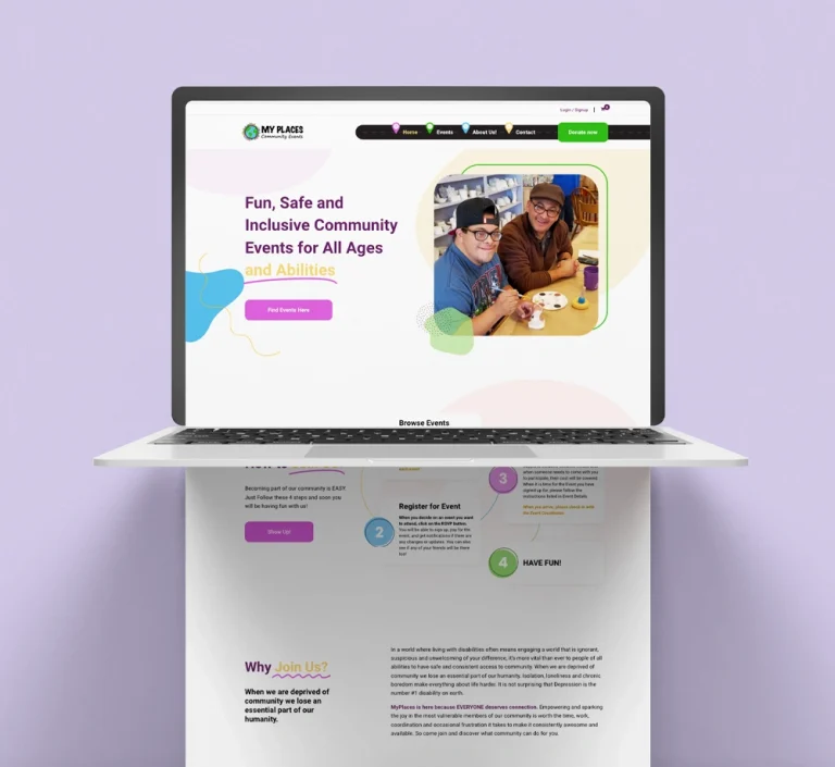
As their web design project partner, I set out to create a website that would be not only aesthetically pleasing but also easy to use and accessible to all.
With a focus on UI / UX design, I implemented several features to make the website accessible to everyone; This included choosing the right font size and ensuring that the text was easy to read, using colors that contrasted well to help those with visual impairments, incorporating descriptive icons, creating well-labeled forms, and structuring the content in a clear and organized way.
Fonts
As their web design project partner, I set out to create a website that would be not only aesthetically pleasing but also easy to use and accessible to all.
With a focus on UI / UX design, I implemented several features to make the website accessible to everyone; This included choosing the right font size and ensuring that the text was easy to read, using colors that contrasted well to help those with visual impairments, incorporating descriptive icons, creating well-labeled forms, and structuring the content in a clear and organized way.

Color Pallete
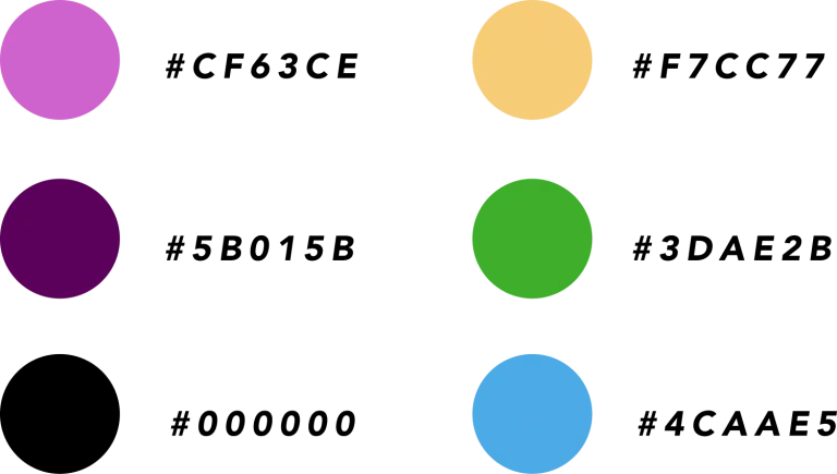
I based the color palette on the brand’s colors. To ensure accessibility, I selected the main colors with better contrast, which are used for titles, main text, icons, and buttons.
Content Architecture and Site Map
We aimed to achieve two main objectives with this website – firstly, to facilitate finding and reserve and event as well as to make donations.
To achieve these objectives my client and I developed an information flow based on a sales funnel. This flow includes buttons at every stage, guiding the user towards the desired actions.
Furthermore, we created a site map to ensure the content architecture was well-organized and optimized for user navigation. Our primary goal was to provide an excellent user experience for anyone using the website.
Final Product
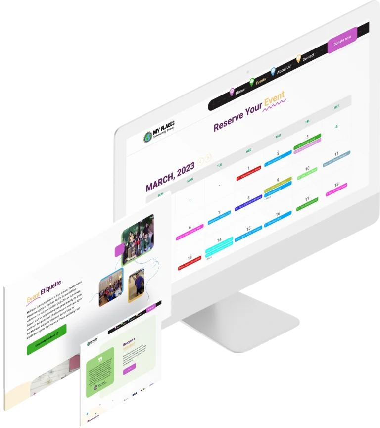
Throughout the design and development process, I worked closely with the non-profit organization to ensure that the website met their needs and reflected their mission. The end result was a website that was visually appealing, easy to navigate, and accessible to all.
As the project involved both design and development, I provided direction to the web development team to ensure that the website was built to our exact specifications. The result was a website that not only met the needs of the non-profit organization, but also helped them to better serve their community by providing safe and consistent access to community events.
My LatestWorks
Here, you’ll find a collection of my most recent projects, showcasing my skills and expertise in a variety of fields.
