My Dodad Project
A website designed to assist caregivers in their care duties and help them to communicate their support needs through Person-Centered Documentation.

My Do-DAD
My Dodad is a company that focuses on Person-Centered Documentation. It assists caregivers in providing better care and obtaining better support by enhancing their knowledge and understanding of the support they require and the amount of support they receive in reality.
As part of the My Dodad team, I developed their brand image, aiding their marketing and social media strategy, and creating a website that specifically highlights the software’s features and the benefits it provides to caregivers.
What did I do?
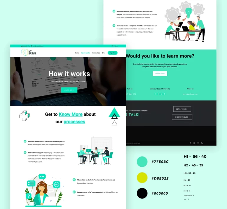
I designed a website that is easy for users to navigate by utilizing UI/UX design methods. In the process, I considered the characteristics and needs of our target audience, as well as the primary objectives of My Dopad company, which was to showcase the software’s features and the benefits it offers to caregivers. Together with My Do-dad team, we established the funnel flow and primary conversion actions, as well as the content structure and sitemap.
Each page was designed with the user experience in mind, also the user-flow includes all the necessary calls to action to drive conversions.
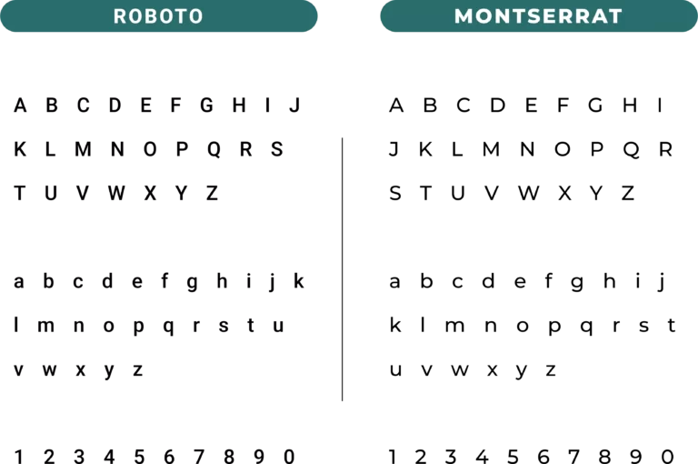
Fonts
I designed a website that is easy for users to navigate by utilizing UI/UX design methods. In the process, I considered the characteristics and needs of our target audience, as well as the primary objectives of My Dopad company, which was to showcase the software’s features and the benefits it offers to caregivers. Together with My Do-dad team, we established the funnel flow and primary conversion actions, as well as the content structure and sitemap.
Each page was designed with the user experience in mind, also the user-flow includes all the necessary calls to action to drive conversions.
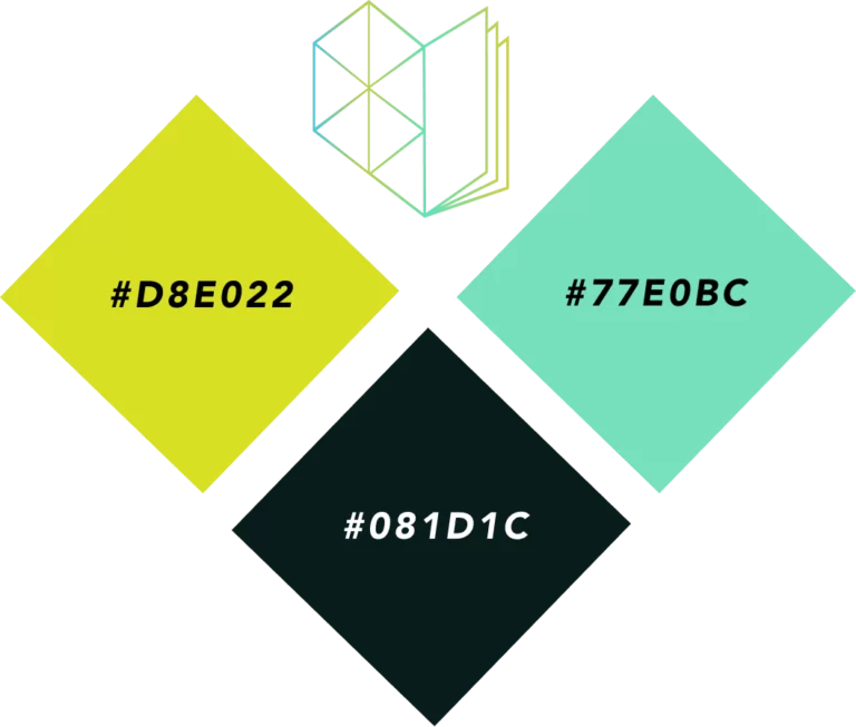
Color Pallete
I selected the brand color palette to convey a sense of comfort, hope, and health. The chosen colors were carefully selected to create a modern and hopeful look and feel, with primary colors chosen for optimal contrast in elements like titles, icons, and buttons. For the main text, I chose black to ensure clear readability.
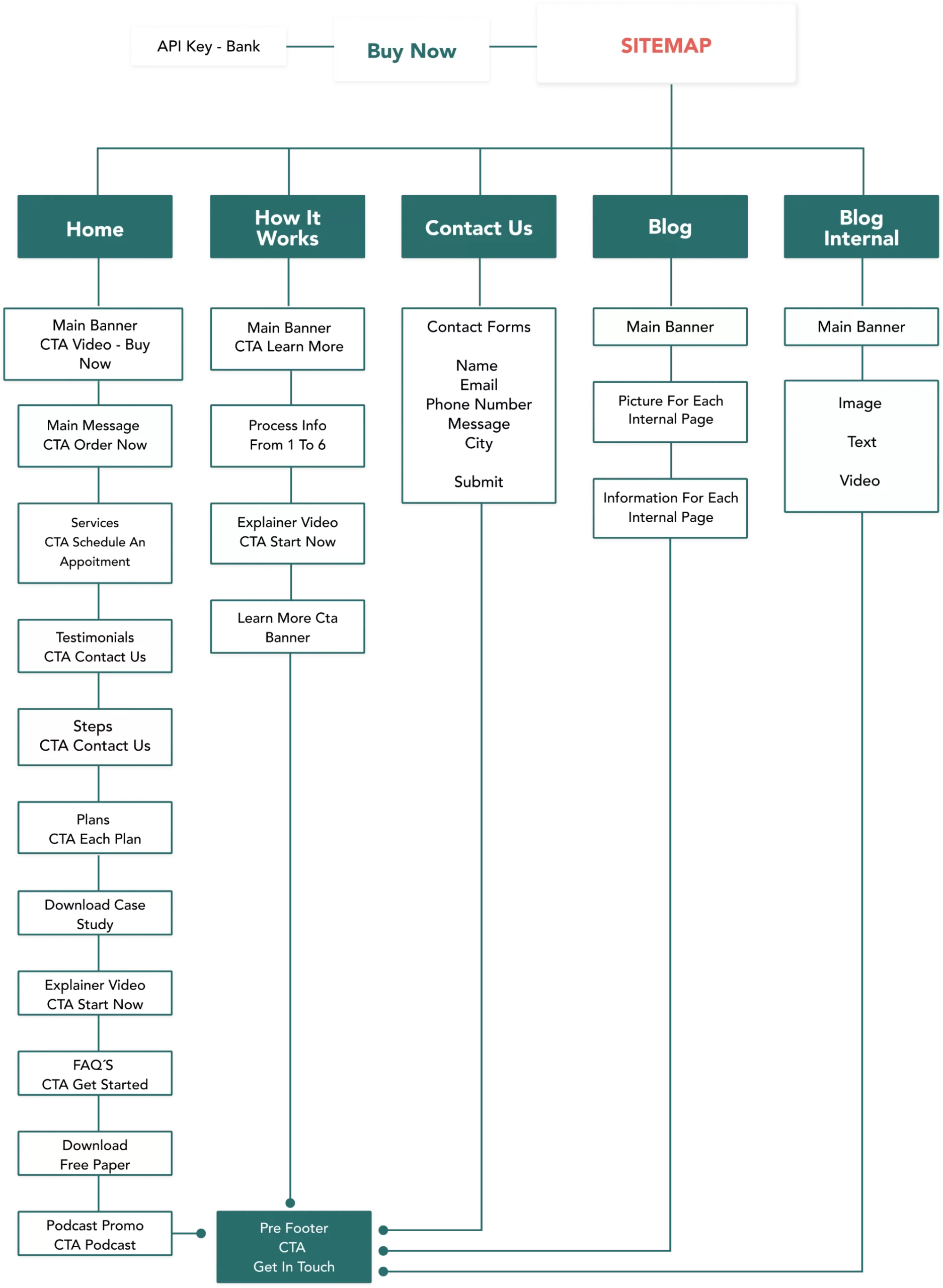
Content Architecture and Site Map
The primary objectives of this website were to help users understand the benefits of the software and how it can simplify their daily activities, highlighting its characteristics, features, and potential results as an easy solution for documentation needs. The secondary goals were to generate three primary conversions: purchasing a monthly plan, contacting the company, or scheduling an appointment to learn more about the software.
To achieve these objectives, we designed an information flow that followed a conversion funnel. At each stage of the flow, we included buttons that directed users towards the desired actions.
To ensure a great user experience for all visitors, I designed a sitemap based on the sales funnel, which organizes the content and optimizes navigation.

Final Product
This project was unique in that it involved both design and development. I was responsible for directing the process in both areas and worked closely with my team to ensure that the design effectively conveyed the essence of the brand. Additionally, we focused on creating a user-friendly structure and content flow for the website.
The end result was an attractive and easy-to-navigate website that fulfilled all of our requirements and met our main goals.
My LatestWorks
Here, you’ll find a collection of my most recent projects, showcasing my skills and expertise in a variety of fields.
